As a developer, I want to be able to add heading margins much in a similar fashion to how web pages usually set noticeable margins in top of any headings to sufficiently separate them from the article flow. Sure, I can add margins or spacers manually, but as a programmer I find relying on auto layout very intuitive and providing consistent and applicable designs. Surely there must be a way?
Working around the problem
There are numerous workarounds we can try to navigate around the issue.
The simple one is to add an auto layout Shift + A but that gets tedious over time, and the margin cannot then be binded into a style definition – the very thing that makes Figma so powerful to begin with.
In the text settings there are settings for line height and pargraph spacing. In theory it is well possible to modify the line height to achieve the look, however, this would not work as intended on multiline headings, and may actually cause more trouble than it fixes.
Another way to go around this is to add an empty line on top, but that I like even less as it is a clumsy way and results in less than desirable fiddling.
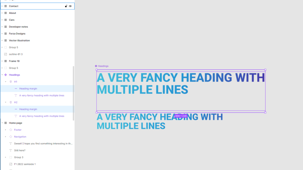
The best option currently seems to be to create a new component, and have the defined heading mated up with a completely transparent square element, both in an autolayout component. All margins can be shut to 0, with just the spacer size acting as a top margin. This way there is full support for multiline headings and other than cluttering the component tree with yet another asset, there aren’t many downsides.

Hoping for changes
Even though this workaround works for most cases, it takes additional time to set up and is not intuitive for less experienced figma users. Having the text margin added into the text style definitions would also mean that the text margin can be added to Figma’s inspector, and therefore is easier to communicate to developers.
In any case, having less redundant components and deeply nesting group structures is always a bonus, and reason enough to hope figma adds it in.


